Phase one
A mental health care app for those who are not yet in crisis but still need assistance.
Date 2022-2023
Role: UX Designer and Researcher
Tools: Figma
Deliverables: Competative analysis, User perona/interiews, User testing, User flow, Wireframes, Evolution of design, Style Guide, Final Prototype
Story
The current system of mental health care is in crisis. Many parents face significant difficulties in finding appropriate help for their children, especially when their children's mental health issues may not be immediately life-threatening but still profoundly impact their quality of life.
Problems
Lack of Resources: Mental health services are often underfunded and overwhelmed, leading to long wait times for appointments and limited availability of specialized care for children.
Stigma and Misunderstanding: There is still stigma surrounding mental health issues, which can prevent families from seeking help or receiving adequate support.
Criteria for Care: Many mental health services prioritize immediate risk (such as suicidal ideation) over chronic suffering, which can mean that children who are struggling but not in immediate danger may not qualify for intensive support.
Complexity of Needs: Children with mental health issues often require a comprehensive approach involving therapy, medication, and support for families, which may not be readily available in many healthcare systems.
Navigating the System: The process of finding and accessing appropriate care can be daunting and confusing for parents, especially when they are already dealing with the stress and concern for their child's well-being.
Solution
Increase Funding and Resources: This includes expanding mental health services specifically tailored to children and adolescents.
Combat Stigma: Educating the public and healthcare providers about mental health issues can encourage earlier intervention and support-seeking behaviors.
Improve Access and Equity: Efforts should be made to ensure that mental health care is accessible regardless of socioeconomic status or geographic location.
Holistic Approaches: Recognizing that mental health issues are complex and require comprehensive treatment plans that address both immediate concerns and long-term well-being.
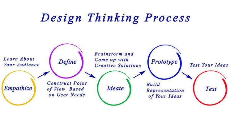
I used the Design Thinking Process to structure and prioritize users needs
Research
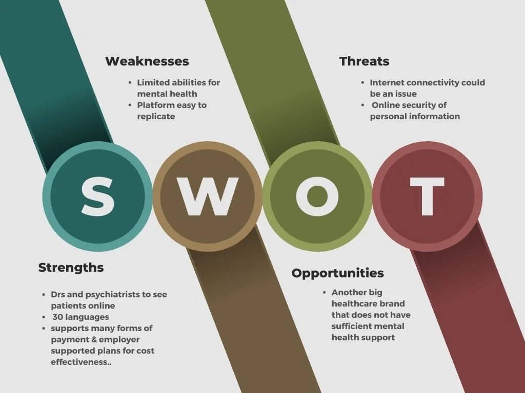
Dr. on Demand
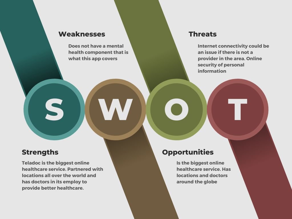
Research was collected to determine competitors’ methods for addressing mental healthcare with mixed results.
Neither Dr. on Demand or Teladoc Health have immediate access to a mental health practitioner.
There are no options for other modalities of help like music, meditation, and individualized app customization.
Teladoc Health
Journey to Better Days will address these by:
Assisting clients 24 hours 7 days a week with mental health issues by licensed therapists.
Offering an application that can be customized by the client to allow other modalities of help.
Empathize
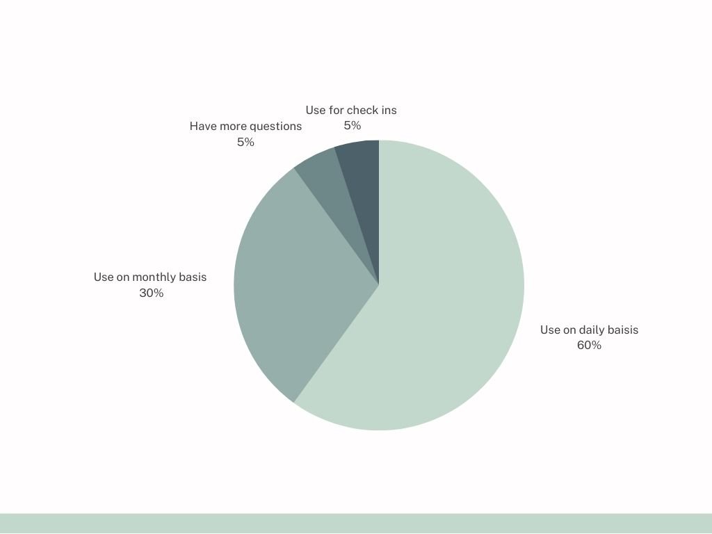
To build an application for a particular audience who needs mental health services I used interviews and 25 user surveys to identify a possible user base and behaviors.
Findings
Users would like a generalized application with many features and a personalized portal.
Most participants were interested in the idea.
Some participants were hesitant due to questions of insurance, and cost.
Graph of Results
Define
Using survey information I interviewed three potential users to find clarity.
Qualifiers
Participants have used healthcare applications.
If they are concerned about internet security.
Have ideas of features that would have helped them in past experiences or would like to see created for motivation and engagement,
Each of the three participants thought a button to get help immediately would have helped in their time of need.
Ideate
From the goals and needs of the research findings I created user personas, flow carts of tasks, and conceptualized features of the application for development purposes.
Based on persona findings and to get different perspectives on application functionality and features to meet various user needs, I hosted an online and in-person card sort.
Results
Features like motivation, meditation, and music were well-received
Clients were not very interested in managing their personal information
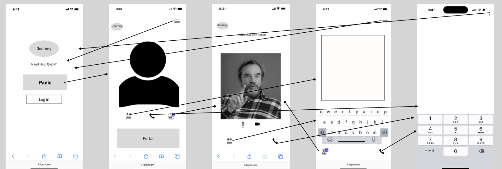
Prototype
Test
Enlisted six individuals from diverse backgrounds to test the resulting application in real-time and assess the accessibility of its features.
Goals
Observe thoughts, reactions, and knowledge
Finding pain points to develop
Gather feedback
Results
The community page was unclear
The splash page was too busy
The idea of a panic button was determined useful but made the user feel uneasy
Refinement
Minimal UI was used to focus on the message
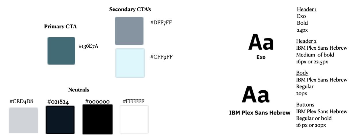
Soothing tonal blues and greys to convey calm and understanding
Text fields and boxes refined by shading for sleeker design
Colors and Style Guide
Accessibility
In the past, I worked with blind and deaf individuals so making a user-friendly application is important for full access.
User can choose between size and font options
User can opt for text or audio options
Background options for further enhanced visibility


