

I build brands and campaigns from first concept to final, polished work, across digital, social, and print.
Proficient in Figma, including components, design libraries, and clickable prototypes.
Figma · Adobe Creative Suite · Brand Systems · AI-Assisted Workflows (Midjourney, Gemini, ChatGPT, Claude)
Carter Kelton - Graphic Designer
Brand Design
Brief: A gaming startup needed a full brand revamp after a personnel turnover left the company unable to keep using its previously owned imagery, on a two-month timeline.
My contribution: I worked as the graphic designer alongside the owners and marketing department to define the company's new colors, visual feel, and core branding elements for company-wide messaging.
Thinking: The existing identity leaned on reds and oranges, which read as aggressive and narrow. The owners wanted to reach a much wider audience, teens through fifty-year-olds, so I moved the palette toward more inclusive, less combative colors that wouldn't alienate older or more casual players while still feeling energetic enough for a gaming brand. Every choice was made collaboratively with leadership and marketing, since the rebrand had to work across every touchpoint, not just one product.
Result: The new branding rolled out company-wide, shipped cleanly, got adopted across all touchpoints, got positive internal/owner feedback, and has seen slow but steady traction with the broader audience it was designed to reach.
Working with the owners and marketing team, I helped shift the brand toward a more inclusive, welcoming identity built to reach a much wider audience, teens through fifty-year-olds, while still reading clearly as a gaming brand.
Colors: Broader, more inclusive palette, moving away from the original red/orange scheme to feel welcoming rather than aggressive
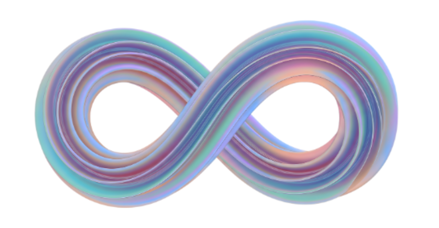
Logo: A modified, multicolor infinity symbol representing the brand's different facets
Typography: Close to genre conventions, with deliberate small differences for market differentiation
Voice: Friendly, cooperative gamer tone, encouraging rather than competitive
Positioning: A company built around games and ideas that are multifaceted, layered, and meant to be played together
Deliverables
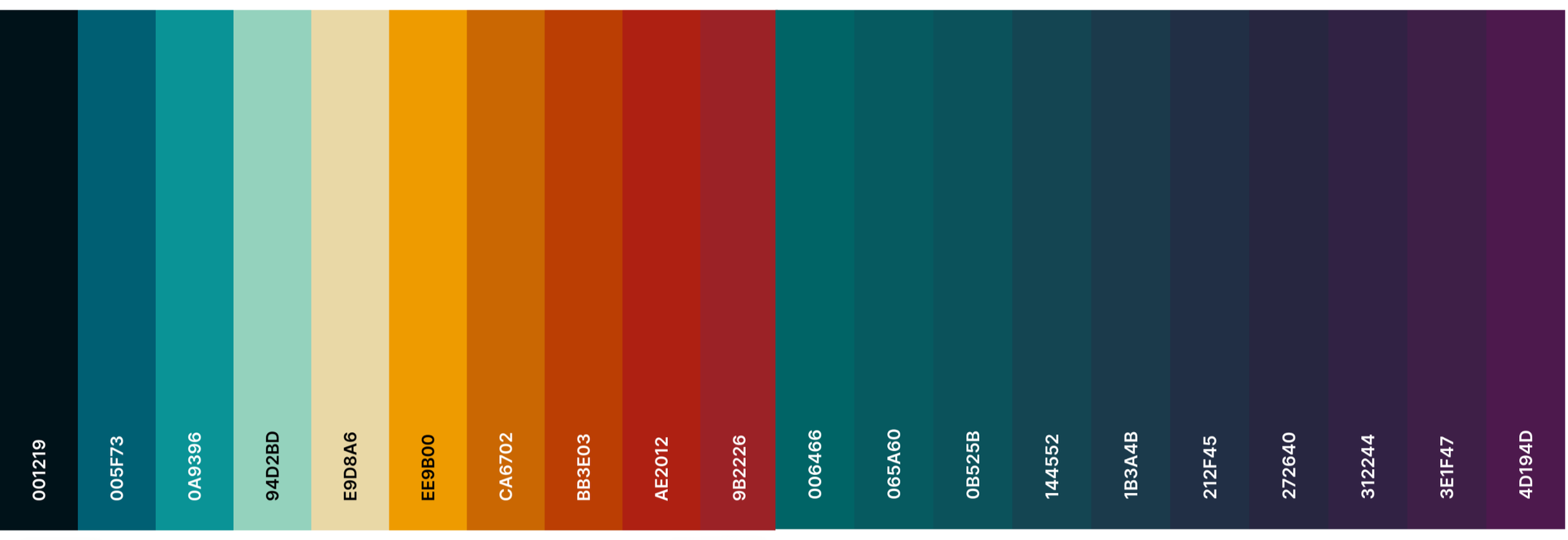
Brand Colors
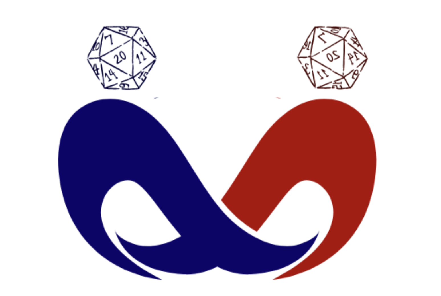
Logo before
Logo after
Typography
Event Design and Marketing

Brief: Non-profit adaptive sports company needed a design based on Louis Armstrong’s “Its a Wonderful World” for a fundraising gala
My contribution: I worked as the graphic designer, getting buy-in from the board members, printers, and marketing department to create the full visual messaging for the event.
Thinking: The theme was a wonderful world, celebrating the organization and its mission. I watched the video of the song. I used Midjourney to create a paper art globe-like structure that also gave the appearance of a rainbow. Within the globe, a disabled skier on mountains surrounded by music, musician and dancers.
Result: The board loved it. It became the image used for posters, invitations, and marketing.

Concept & Art: Original Midjourney-generated paper-art illustration, a globe-like rainbow structure featuring a disabled skier, musicians, and dancers, built around the theme of "What a Wonderful World"
Print: Gala invitations, event posters
Digital/Social: Marketing graphics for event promotion
Stakeholder Coordination: Worked directly with board members, printers, and the marketing department to finalize and produce the final assets
Deliverables

UX/UI Design

Health Included
Brief: A concept for a concierge-style health platform, bringing mental health, fitness, and medical care into one individually designed experience for each client.
My contribution: I led the UX/UI design end-to-end, mapping user flows across multiple service areas and building a fully clickable Figma prototype to test and present the concept.
Thinking: I approached this as a design challenge: how do you make a platform feel personal and simple when it spans mental health, fitness, and both Western and Eastern medical care? I mapped each user path individually. The prototype included a vetted provider network comprising psychiatrists, counselors, MDs, and OMD/TCM practitioners, so I also had to design for trust and credibility, not just navigation.
Result: The prototype was presentation-ready. It's a strong example of how I approach complex, multi-layered UX problems from the ground up.
Webflow (responsive builds, AI Site Builder)